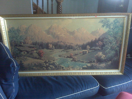
 Some of you may remember this lovely painting from a week ago or so....isn't it a beauty?!?
Well, one of the things that made me snag it like a bride at one of those clearance sales was that it really isn't a "painting"...it's chipboard with a picture printed on it (Gotta LOVE the 70's!) and the frame has some pretty good merits.
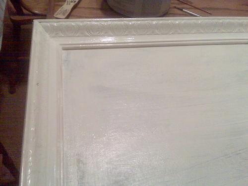
I wiped it down with a damp rag and then painted the entire thing with leftover ceiling paint from J's room. I really like the color...not too white...not really a cream.
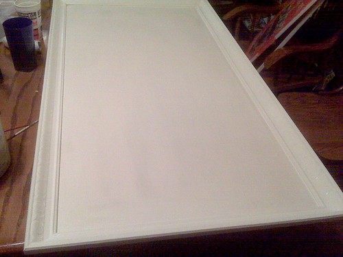 Originally I thought that rubbing some brown paint over the details on the frame would be fantastic....distressed ended up looking dirty...like I rubbed it with an old diaper!
 I figured that I'd just keep it white then....until I realized it was too big to fit on the wall I had intended it going on in the kitchen!!! (this all happened after a completely ridiculous day that I'll blog about soon, but forgot to take the picture of my mishap...errr)
With those plans scrapped, I'm kind of at a loss. It ended up fitting perfectly on the wall above the boys' school desks, but I haven't painted the dining room (I don't have any idea what I'm doing to that room yet!).
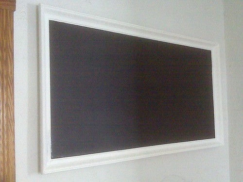
People, we have a serious CODE WHITE going on here~~~white frame on a white wall is BORING! What should I do? Do I try and rub on a different color...even after my disastrous aging attempt! Do I repaint completely...the boys' desks are school red (no other way to describe it...and I wasn't going to take a picture because the floor surrounding the desks looks like a Crayola factory exploded!) Or do I just leave it because I have monsters for children and chances are the whole thing will get painted over a bazillion times any way....suggestions would be soooo welcome!
I do seriously LOVE this frame...*sigh*
Thank You fellow cheapo craftsters....YOU ROCK!


9 comments:
First of all, let me say just how brilliant you were to snatch that thing up!
I suggest painting it an accent color. If red is the color you are wanting to highlight in there, go for it. I think any bright color would look awesome against the black board and white wall.
Can't wait to see the final outcome!
That is fabulous. It's the most gorgeous chalkboard I've ever seen! I'd leave the frame white and paint the wall. Make a square of colored paint or paint the walls or something.
Unless yo ucome up with something that will still highlight the great features in the frame.
That is fabulous. It's the most gorgeous chalkboard I've ever seen! I'd leave the frame white and paint the wall. Make a square of colored paint or paint the walls or something.
Unless yo ucome up with something that will still highlight the great features in the frame.
Well done! I wish I had an eye for that kind of thing. I admire you for it.
Paint a large square of color around the wall, beneath the chalkboard. That's my vote!
You can still apply a rub to bring out the details, just don't use straight paint. Use a stain that you brush on then wipe right back off. Or you could use watered down paint. You just want it in the nooks and crannies and you can wipe off the rest with a damp cloth maybe.
Thank you ladies! As far as painting on the wall, ehhhh...the walls are super olf plaster that I want to try and smooth out...takes forever...started in the upstairs hall and then going down through the living room to the dining room and the rest of the lower level. (I'm eshausted just thinking about it!)
Jennifer--that must have been my problem--I just wiped on straight paint. Mybe I'll repaint the frame and then wash the white onto the cracks...hmmmm.
I'd just leave the frame white if I were in your shoes. Love the contrast of the chalkboard w/ the white...even on the light wall.
I'm hosting my first giveaway on my blog, and I wanted to invite you to stop by for a chance to win fine art print(s):
http://theredchairblog.blogspot.com/2010/02/introducing-prairie-storms-prints-and.html
What a great idea! I like the white, I think it looks great.
Post a Comment